Client: BlockSurvey
BlockSurvey is participating in a movement, one that wishes to highlight data responsibility as one of the key focus areas for the near future. They have built a survey platform on Blockchain technology which empowers users by protecting digital rights. Part revolution, part product, Kwa:zi was chosen to build the identity and product alongside their uber-talented team.
The process of building an identity followed by UI/UX product design can be tedious and long-drawn (as it should be). We’ve tried to delineate our approach to working on a project of such an expansive nature.
The brief was rather simple on the face of it –
To create a survey platform and make it easy to use.
To achieve the ideal user experience, we started small, we figured out the primary digital behaviours:
How, where and why does the user land on our home page?
How can we channel the user to using the product optimally?
The aspect of being hosted on a blockchain platform was one of the USP’s for the product and had to be reflected through design.
We kept in mind to map out the behaviorally efficient journey for the users to optimize the product. Upon understanding the product applications and uses we were able to prepare innovative design themes to match the product quality of some global giants in the field, namely Typeform and Survey Monkey.
The primary research we conducted on survey platforms led us to gain a deeper understanding of the ebbs and flows of survey products out there. We tried to ensure that we analyzed products across the board including Google Forms, which is infamous for its basic design. But had stupendous UX. Lessons were imbibed from all these platforms alike and all of them seemed to be targeting a particular competency.
While research is being corroborated by the client we get to the most exciting part of the process, yet equally challenging.
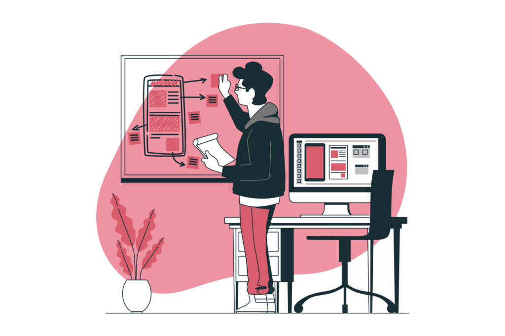
Whiteboard! The UX designers best friend.
The product must be broken down to its nuts and bolts, which is the user journey.

BlockSurvey was not just promising data privacy with anonymity as their USP but a globally viable survey platform as well. To ensure that we could rival the best product designs, we took inspirations and built our UI screens to account for whatever we felt was missing elsewhere. The live preview tool which enabled the experience of seeing every action manifested into a form, was a UX victory for us.
Here’s the process for the BlockSurvey UI/UX design:
1. Concept & Ethos
We conceptualized 3 unique identities envisioning the BlockSurvey brand promise. Our focus was to give security, privacy, and decentralization an impressive aesthetic existence in their logo.
2. Brand Identity
Branding identity was cemented once the logo has been finalized and subsequently expanded into a design language that was reflected through every user touchpoint.
3. User Journey
We mapped and charted the user journey keeping in mind that the product has specified user personas. We followed industry best-practices to keep the product learning curve minimal. All the decision flow-charts and user touchpoints were optimized with the end goal of user flow in mind.
4. Wireframing
Wireframing is the skeletal representation of the product which visually encapsulates the user journey. It outlines the UI screens and their layouts. In many situations, user journey redundancies can be found at this step.
5. Prototyping
The skeletal structure is followed up with UI (User Interface) – the visual manifestation of the product. We begin aligning the colours, iconography, illustrations, CTAs, typography and other details. The prototype is an accurate render of the final product and is the last step before development.
6. Handover
We prepare a design system for the product which is a guideline document for all components, icons, typography and other details that would be used and re-used throughout the product while in development. A developer’s handbook if you must. We also assist in ensuring the design can be reproduced to its proposed perfection. Any advise and edits required to make the project wholesome is our priority.
Some of the other design detailing we worked on included:
The Dashboard
The look and feel with UX considerations were thought through. We ideated a method by which each step acted as a tutorial for the first time user. From setting up a survey to adding questions and choosing multiple options for the form-filling experience, we attempted to make the product as simple for usage through visual cues.

When working with products we aim for a seamless product experience all across the board. Hence the logo’s fluidity and dynamic nature allowed us to build an aesthetic language around it to expand it into a visual language that uplifts the product.
A design language creation is the result of some great attention to detail. We attempt to select an elementary piece of the brand visual and apply it across multiple applications.
In this case, the idea was elegant yet so simple that we had to just be inspired by its primordial origin. Blocks.
The idea of BlockSurvey is both simple and complex – just as we could use simple blocks to build complex structures. A truly meaningful product with a great impact on the future of technology in India and beyond.
We must note that found a great collaboration with the team at BlockSurvey, a huge shout out to all of their wonderful team and especially the Co-Founders – Raja and Wilson. It was due to their clarity that we were able to fuse such a cohesive brand and UI design together. Interestingly, for BlockSurvey the challenge has just begun and we hope we’ve equipped them well.


