Sivakumar Sethurman, or Siva, as most people know him, is a treasure trove of interesting, lesser-known tales from History. He has a knack for making the subject interesting to even those who detested it throughout their childhood. He is often found at the centre of a circle, holding the attention of a group of people, narrating one of his fascinating tales, in a voice that transports the listeners to a different time and place. He also shares these tales by writing them down, on Facebook and Medium. However, these written versions lacked that special something that drew so many people to his stories: they lacked the magic of his voice that people loved listening to as they sipped their evening tea. Thus, on the urging of a few colleagues and friends, Siva decided to present his stories through podcasts. Among his colleagues and friends is Anupriya Mohta, an advisor to Kwa:zi. She believed the team could successfully develop a visual identity that would be as intriguing to listeners as his stories are.
We used two aspects of the podcast as inspirations for developing a design language and identity: the first was the idea of “masala” history, or history that is spicy and colourful, and second was the idea of listening to his tales over tea, of having historical tales become a part of everyday conversations. We were cognisant of the role that the design language would have to play in dissociating the subject of history from its long-held association with being boring and drab.
Imagining an Identity
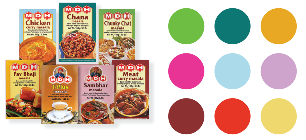
One of the most important tools a designer uses to develop a brand identity is colour: after digging around for a while, we found that the masala boxes, easily available at most grocery as well as kirana stores, provide a readymade colour palette of bright shades for us to pick from. These colours are such a departure from the black and white, and sepia tones that people often think of, when they think of History.
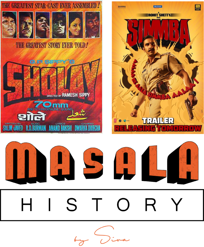
In India, masala also brings to mind Bollywood’s “masala” films, which served as sparks of inspiration for the logo, and the typography in general. For an audience that is familiar with the iconography and visual language of Bollywood, the Masala History logo automatically brings to mind a deeply embedded visual memory of these films, and their associations with drama, and action. This association allowed us to rebrand History as a subject that is as full of twists and turns as Bollywood’s masala films, and is more than just a series of dates and list of treaties. This identity that we were able to conjure by making an association with masala films, aligns well with Siva’s short narrations about say, the first female monarch of India, or the untold stories of Lord Mountbatten.
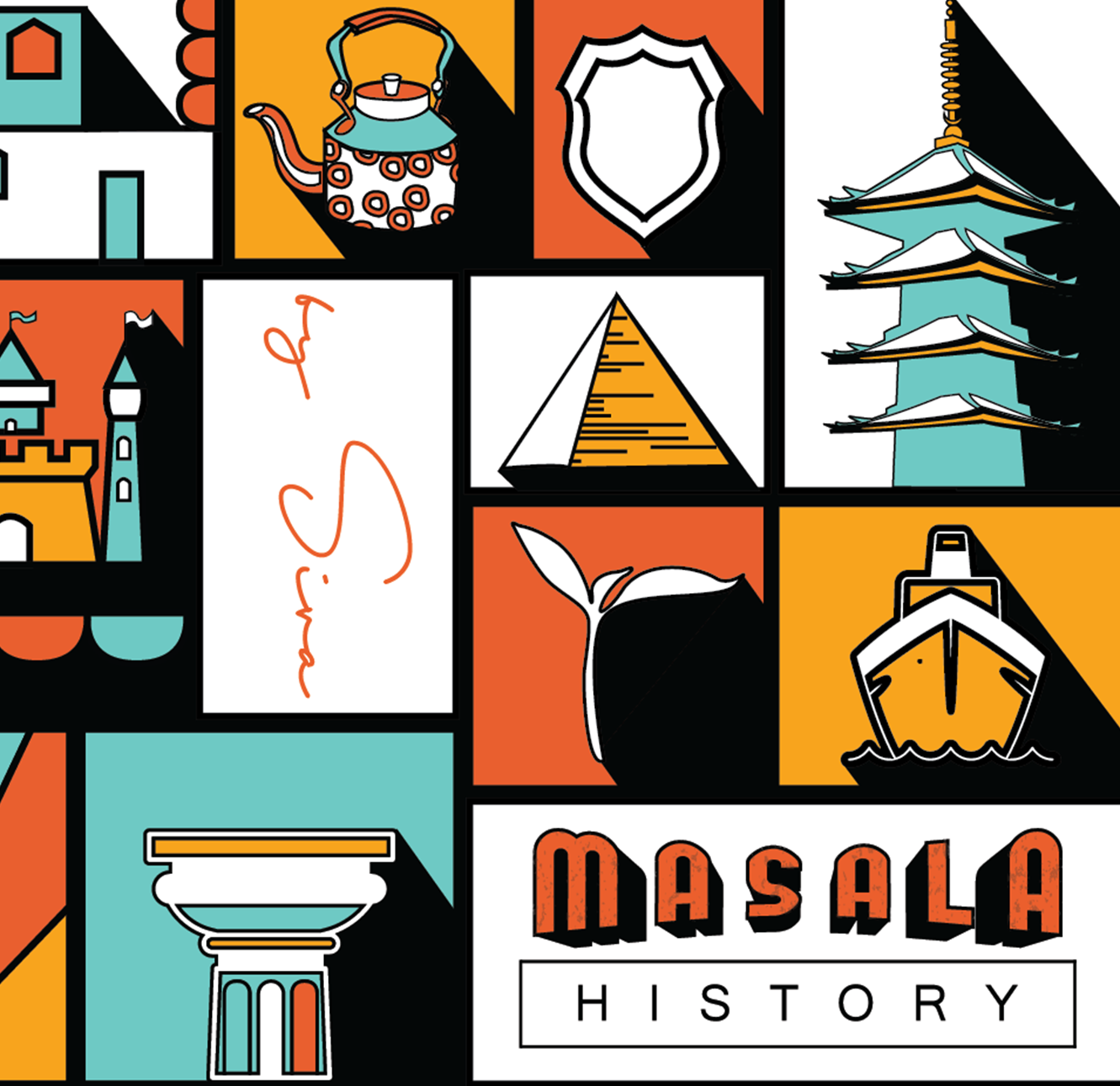
Our visual language, replete with icons rendered in bright colours, triggers the connection between History, and the idea of stories being told over tea. While an association with the former is conjured through symbols of the Taj Mahal, the Great Pyramid of Giza, and the Leaning Tower of Pisa; the latter is expressed through icons of the teapot, tea leaves, and Parle-G. Despite the ‘Indian-ness’ of the colours and the typography, the design language makes a conscious decision to include elements of global History so as to not restrict the material of the podcast to tales only from the Indian subcontinent.
Employing the Design Language to Tell Stories
As a guiding principle, all of us at Kwa:zi are mindful of the need for a coherent design language and visual identity in all brand identities that we build. Here too, we ensured that Siva could extend the same to whatever verticals he decides to initiate in the future. Thus, we made sure to create and employ a distinct colour palette, and easily replicable illustration style; all of which could be used to create designs on his own in the future, while still making sure they fit in with the larger identity of his brand.
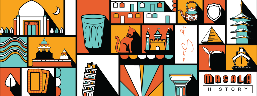
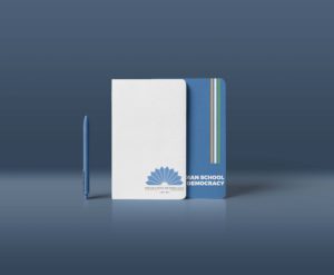
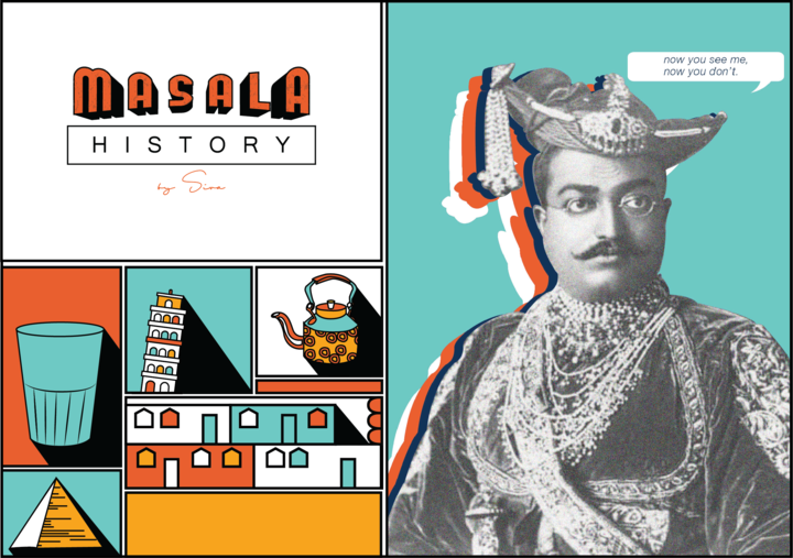
The playful design language, intended to be attractive and inviting, as opposed to intimidating and drab, lends itself easily to experimentation. In another collateral we designed for him, we made the existing language interact with a black and white image, demonstrating one of the many ways in which the language could be used above and beyond what we had imagined possible for something that was in the space of history.
Parting thoughts which will soon be History
For us, the project at hand with Masala History was not merely to design a logo, cover art, or visual identity; instead, it was to rebrand the subject of History, to shift existing perceptions, and to make a wider audience realise how fascinating and relevant to contemporary times the subject can be. By creating a design language and visual identity for the podcast that is inviting, youthful, and fun, we hope to achieve Siva’s larger goal of making people recognise History for the fascinating subject that it is.
